
In single-seater racing it’s usually pretty easy to work out how well a driver did – you look at the race result. To be sure, sometimes you have to make allowances for mechanical advantage, or better preparation in spec series. But in general, when there’s only one person in the car, odds are they had something to do with where it finished.
In endurance racing, with teams of anywhere from 2-4 drivers, it’s not so easy. As an extreme example, take Algarve Pro Racing’s #25 in the second round of the 2023-24 Asian Le Mans Series. That car was struggling to remain on the lead lap when a safety car brought the field back together with around 100 minutes to go. Like most teams APR took the chance to put their best driver in. Between good strategy and great wet-weather driving Malthe Jakobsen advanced from fifth to first to take the win. But it’s fairly clear that just because they won the race doesn’t mean the #25’s Bronze and Silver drivers did better than those in the #91 which lead before the safety car.
So how do you figure out how well individual drivers did in endurance races? This article runs through a few methods, using the two Asian Le Mans Series races from Sepang as example data. I’ll be specifically looking at Sarah Bovy, because a) I had to pick somebody and b) a friend was asking how her performance compared to Silver-rated drivers.
The plan is to start with the simpler methods and gradually increase complexity
Fastest Lap
This is probably the simplest method of all. Which drivers drove the fastest laps? Well, that’s a simple enough question to answer:
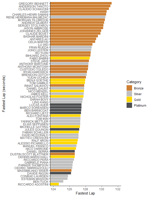
Sarah Bovy here is looking fairly mid-pack which is reasonable for a new Silver. A few anomalies seem to show up – Massimiliano Wiser looks very fast for a Bronze but he was, like Sarah Bovy, promoted to Silver; unlike Bovy he’s making the most of the last competition he can race in at Bronze. Dustin Blattner’s time on the other hand is legit – well, mostly. The early part of the race had several safety cars, meaning Blattner would have done something more akin to the push/cool/push strategy of qualifying. Still, that’s true for most of the other Bronzes too…
While this is a very easy method to both compute and understand, it has a few problems. The most obvious one is that races aren’t qualifying competitions, and what’s important is overall pace, not single-lap pace. There’s also issues like the Dustin Scott Blattner one above – some drivers might have a better opportunity for a “qualifying lap” during the race. We can see an extreme version of that in what happened in the second race:

Wait, why are all the best drivers putting in the worst laps? If you watched the race (or read the intro paragraph) you already know – it rained late in the race when those drivers were in. We’re also seeing there’s not a huge amount of consistency in what order these names come in, possibly suggesting fastest lap isn’t the best measure of a driver’s race pace. So what if we look at a more sustained measure?
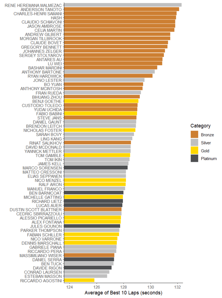
Average of Fastest 10 Laps
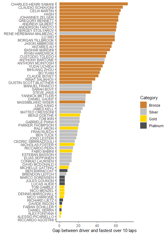
Instead of looking at a single lap, we could instead look at the average of a number of the driver’s best laps. This is the method the FIA uses when it’s evaluating the driver’s pace when their categorisation is reviewed. For that use case it’s a pretty good metric – the idea is we’re dropping out laps where they were balked by traffic or made mistakes. This means the number we come up with might be considered something like their “best race pace”. Here’s how that looks in race one, with a fairly similar order to the fastest laps but with several of the Platinum drivers moving up the list. Sarah Bovy again remains slightly back-of-midfield…
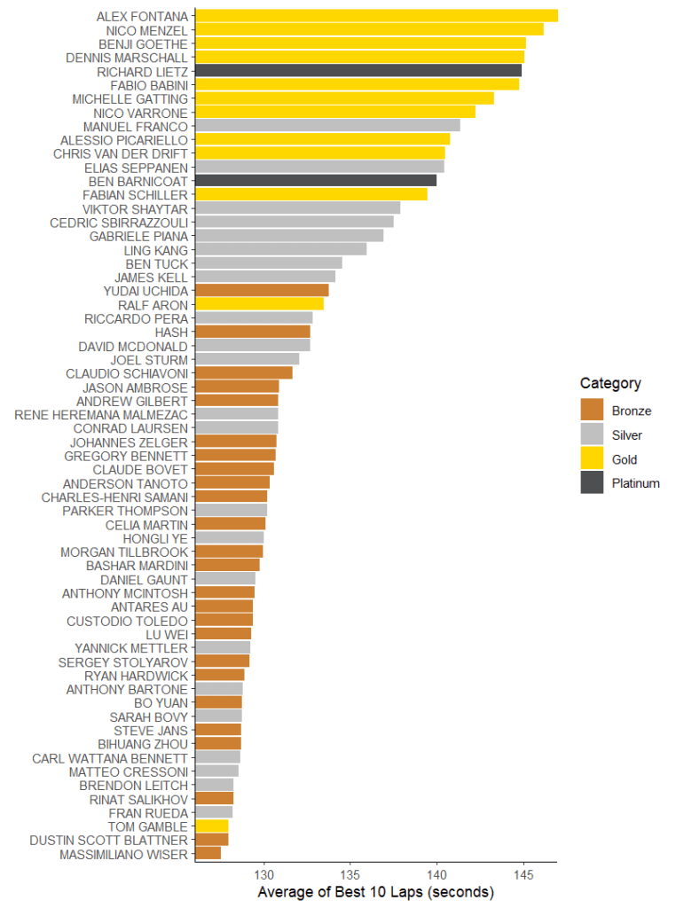
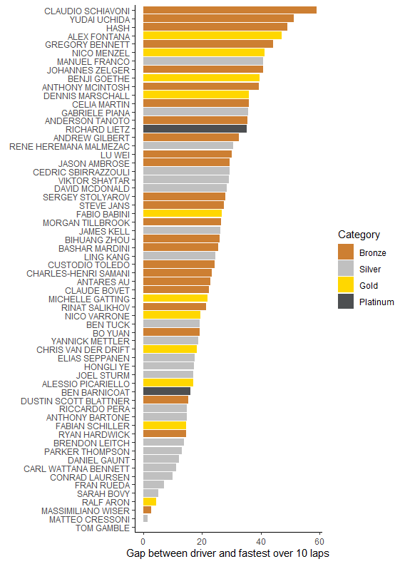
And here’s the graph for the second race. One thing this does show is that this method is in some ways even more dependent on conditions than the previous one. The ordering now being much closer to “how early did you get in the car?”.
The problem with applying this to a four-hour race like those at Sepang is that some drivers may not get ten fairly clear flying laps in. With a green flag lap time taking about 2 1/4 minutes and the total green flag race time only being 162 minutes, some drivers end up short of ten full speed laps. This is even more likely in slightly greasy track conditions or other situations where tyre warm-up might take longer. So what about a measure that is less sensitive to how many quick laps a driver got in?
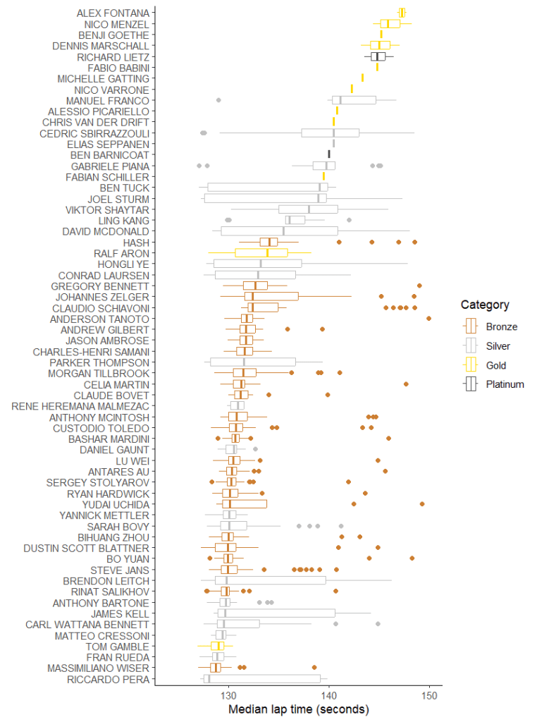
Median Lap
WARNING: The next two paragraphs involves me discussing stats and graphing methods for like far too long. If you don’t care just skip to the graph. Point is, this method is maybe a better method of “actual race pace” rather than “potential race pace” which the previous one did.
The median is the middle lap if you arranged them all from fastest to slowest. It’s a better average than the mean (the sum of all the lap times divided by the number of laps) for this sort of purpose because it’s less affected by particularly fast or slow laps. But here every lap counts – losing a couple of seconds in traffic goes on the bottom of the list, so the middle lap’s slower. But it doesn’t have as big an effect as if you took the mean. So here rather than looking at what the driver could have done in a best case we’re looking at what they actually did. I think both of these have value, but in general prefer this one. After all, the ability to do fast laps despite traffic (or whatever else) is a big skill in multi-class racing.
We can also use this approach to look at the distribution of lap times, by including the median into a box plot. In a box (or box-and-whisker) plot, you represent the median as a solid line in the middle. Then you draw a box around it where the ends are the first quartile (the lap 75% of laps are faster than) and the third quartile (the lap 25% of laps are faster than). The computing package I’m using has a switch which draws “notches” in the box showing a confidence interval for the medians. That is, if you gave the driver a whole bunch more laps, the program (or actually three statisticians who wrote a paper in 1978) is 95% sure the median would be somewhere in the notch. It’s a good way to show if any given driver is meaningfully faster than any other. (Sometimes the notch goes outside the box which looks weird. Then my stats program shouts at me to turn notching off, but I don’t because I still think it’s useful).
Anyway after you’ve drawn the box you draw a line (the “whisker” out to the fastest and slowest laps to show the range. Or if you’re showing off like my graphing package is, you do more maths to work out if any of the laps are “outliers” and represent those as dots outside the lines. An outlier is basically any measurement where it’s statistically improbable that it’s part of the same distribution as the rest. For a lab scientist, usually that means “you did the experiment wrong”. In this case it’s likely that “slow” outliers are caused by heavy traffic or mistakes. “Fast” outliers are either a sign the driver’s not very consistent or maybe did a couple of flat out push laps for strategy reasons. Anyway, let’s look at Sepang race 1, shall we?

There’s some interesting things here – Marco Sorensen, whose fastest laps weren’t that great, turns out to have been very consistent. This suggests to me that probably he was at the limit of his Aston Martin. Not necessarily due to the BoP, but more likely because of a conservative setup to prevent Anderson Tanoto spinning it repeatedly. There’s also the question of why Dustin Blattner is out-and-out faster than his Gold and Silver team-mates (Ben Tuck and Dennis Marschall). Partly, it’s that Blattner is a very good Bronze. Also, as a driver most used to racing in GT sprint events, the stop/start nature of the early laps probably suited him. It might also have been conditions: the track temperature dropped during the race. If Kessel had the car dialled in for the hotter conditions it may have become relatively harder to drive as time went on. Still, we should be impressed. (Frankly, if you were watching the race you’d have been impressed with Blattner anyway as he charged through the field following a turn one incident that wasn’t his fault). I should also mention Sarah Bovy, since she’s our nominal focus. Here we see she’s towards the back of the Silvers, with a wide range of lap times. Combining this with our previous graph of her best 10 laps suggests she has decent potential pace but is struggling to maintain that amidst general racing chaos. Not all that unusual a state for a baby Silver. She would have gotten used to front-running after generally qualifying on pole as a Bronze…
How about race 2, which had a much wider variation in conditions?
Well, the first thing we learn is that a lot of the Pro drivers barely got a chance to set a representative lap. The race was red-flagged as undrivable fairly soon after they got in. You can also see which drivers were in the car when it started to rain and who got out beforehand. (If it’s not obvious the ones who drove in both wet and dry are the ones with the bigger variation in times). Sarah Bovy actually comes out quite well in this version of the graph. She’s probably got above average experience in wet conditions and the Proton cars seemed overall happier. (Note Matteo Cressoni being one of the out-and-out fastest). It probably also helps that the Ferrari and McLaren cars got bigger BoP nerfs than the Porsche did after race 1.
So what we’ve learned so far is that simple averaging methods can be pretty useful and teach us a decent amount. We’ve also learned we can get even more information if we take a look at the whole distribution of a driver’s lap times. But we’ve also learned that we’ve got to apply some outside knowledge and understanding of conditions. Potentially this can be true even in dry races due to things like wind speed and track temperature. Can we build some of this into a measure?
Context-Sensitive Statistics
Building some context into your stats, rather than applying context afterwards, dates back at least to baseball in the 1970s. I’m going to go through a simple approach and a complex one here.
Time to Best Recent Lap
Probably the easiest way to apply context to lap times is just to consider how fast other cars were going around the same time. In short races, this isn’t perfect, because of the conventional strategy where you put the weakest drivers in the car first and the strongest ones in last. Even so, it gives an idea of how a driver is comparing to their peers. In longer races, where there’s often a broader mix of drivers (or in pro categories where all the drivers should be as good as each other) it works better. So it’s not ideal to be using a Pro/Am class in a four-hour race to demonstrate, but we’ll see where we end up.
What I’m going to do here is divide the race up into 80 3-minute chunks. Actually in practice I end up only having 53 chunks once we remove the safety cars, but whatever. Anyway, for each of those time chunks some lap within it was fastest. We can then rate every lap by how close it was to the fastest lap set in that particular 3-minute chunk. To rate drivers, we just take the median for all their laps how close they were to being fastest. (Once again, if we took the mean it’d likely get skewed by one or two bad laps).
For the first race, this looks like this:
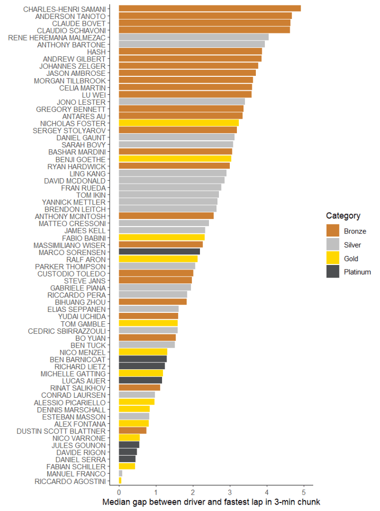
I think this provides a pretty interesting way to look at things, though you’ve got to remember that here we’re really only comparing drivers broadly like-for-like. (I think all the teams ran on the standard Bronze/Silver/Pro pattern for driver stints.) This comparison makes Sarah Bovy look rather worse than the previous ones do, and I don’t think that’s a coincidence. Her laps are still quite uneven as we discussed before, and what that boils down to is “only being on Silver pace some of the time”. That – well, plus a certain amount of car disadvantage which was corrected for race 2 – is what shows up here. Speaking of race 2:

Well, first off we’re very impressed with Ralf Aron, who had 5/8 of his laps being the fastest in their time chunk. (Van der Drift and Schiller both only had one full-speed lap before the red flags came out). That’s not a thing we’d have noticed from just looking at lap times. Generally the Porsche drivers, Bovy included, have moved down (ie, faster) and the Ferrari drivers moved up (slower). That’s the effect of the BoP change. And we’re seeing a fairly large spread across all the driver categories. Partly that’s because we’re comparing like-for-like as most drivers got in the car at the same time. It’s also an effect of the rain, though, which made tyre strategy important – any drivers on the wrong tyre would have been much slower.
Or in other words, we’re learning a lot! This sort of analysis – while it’s not a substitute for actually watching the race – does lead you to ask the important questions you need to ask to learn about what happened. Additionally, we get to pick up on performances like Ralf Aron’s that were genuinely top-class but don’t necessarily look it at first glance.
Multi-Level Regression Modelling
Or “the author is a professional quant analyst and it’s about to become everyone’s problem”.
Unlike the previous method, this one is not simple. And, to be honest, usually you don’t need anything more than the previous method. Sometimes – particularly for a short race – you run into the problem above, where you can only really compared Bronzes to Bronzes and so on. And there is a statistical solution to this.
If you think about where a lap time comes from, there’s three main contributors – the car, the driver, and the track. And there’s a hierarchy of this – 2-3 drivers in one car, all cars on the same track. This, it turns out, is quite a common structure for data. For example, suppose you’re an investor trying to evaluate small German businesses. Businesses are found in individual cities and they’re all in the same country. So it’s probably not surprising that statisticians developed an approach to this. This isn’t a stats blog so I’m not going to go into details of the method – here’s a good starting point if you want that. The short version is that you can treat a lap time like it’s made up of different things that affect it. Like this:

Here all the Greek letters are constants which we have to find the right value of so the equation actually works. Or more accurately which the computer will do for me. Some of them relate to the driver, so there’s one of them for each driver, some to the car, so there’s one for, say, all the Porsches, and some to the track, so everyone gets the same value for the track temperature. In practice, the track temperature probably affects different cars and drivers differently. Unfortunately, we’d need more laps worth of data to build a model that complicated. Even combining the races (which I can’t actually do because the ACO changed the BoP between them) doesn’t get us there.
This required a bit of fiddling to find an equation where the solver was happy it could find something that worked. In the end I had how lap time changes over a stint depending on the driver, and the total lap number and the track temperature affecting everyone. For the second race (where it rained) I added in humidity – what I actually wanted was rain, but the weather report data doesn’t include it1.
We can do all sorts of fun things with the results of this, but for now what we’re interested in is drivers. Of course we’ve now got this idea that drivers might approach a stint differently. Or in other words that just because the first lap of a driver’s stint is faster doesn’t mean they’ll be overall faster. So what I’m going to do is simulate a theoretical ten-lap stint where the track temperature doesn’t change and they’re all in the same car. (To save me the work, it’s a fictious car which is absolutely average and has no effect on laptime). Here’s the results of our simulated ten-lap race based on how the drivers performed in race 1:
There’s a few notable differences to what we had before. Marco Sorensen, who we’d guessed was being limited by his car, jumps much nearer the front. That’s a good sign that we’re doing a better job of separating car and driver. Dustin Blattner falls back, though he’s still one of the leading Bronzes. That’s partly because he seems to have had some of the better track conditions but mostly because the Ferrari was easily the best car. (It’s a good sign that we came to that conclusion, since the ACO definitely agreed as they hit it with a 15kg weight increase and a power loss for race 2). There’s a much bigger concentration of Gold and Platinum drivers as the fastest. This also makes sense, because that’s why those drivers have Gold and Platinum ratings in the first place. All of these things suggest that while the method might be overcomplicated it does at least have some decent value to it. Let’s try race 2!
Well, it doesn’t really work. That’s one of the big flaws of this method – it’s more reliant on having good-quality data. In this case we’re missing the rainfall indicator and my attempt to proxy a “rain” value aren’t quite good enough. (Lacking any better info, I just counted the number of laps from the point I think the rain started. That assumes the rain fell at a constant rate. I watched the race though, and it didn’t.) Alternatively there just weren’t enough rain laps to calculate properly how it affected the race. The model falls short of convergence and we get a warning not to believe the result. For what it’s worth, it’s this:
Good for Sarah Bovy’s fans, but I think I’m gonna broadly side with my regression modelling package and say this isn’t to be trusted.
Conclusion
So what have we learned from all of this? Well, I think there’s a few things you can say:
- It’s probably not a great idea to put too much trust in a single measurement; distributions are more useful
- Context is always important; if it’s not included in the statistic, add it in yourself
- You can make some impressive models if you’re willing to go into stats that need way too much explanation, but:
- The more data you use, the more reliant you are on the data quality
- Sarah Bovy’s currently an average to slightly below-average Silver who has decent pace but needs to work on her racecraft and consistency
- The ACO’s still not really got its GT3 Balance of Performance sorted.
- Technically it does but it’s -999 throughout the race so it’s not exactly useful ↩︎

Leave a comment