Background
Showing the sort of timeliness for which they are justly famous, the FIA confirmed on the 20th May – ten days after the race it had been introduced at – that they’d made a “minor enhancement” to how the balance of performance was calculated.
Previously, the balance of performance (BoP) had been calculated based on a rolling average of the last three races. From Spa onwards, it was to be calculated using the best two out of each team’s last three races. Intellectually, I somewhat approve of this. I believe that the purpose of BoP should be to equalise each team’s ultimate performance, and then their job is to get as close to that over a race duration as possible. You know, a contest of endurance. So moves that bring us closer to that ideal are good and ones that move us away from it are bad. Of course that means I don’t much like the other change made this year, using a manufacturer’s best 60% of laps rather than their best 10%.
How It Works
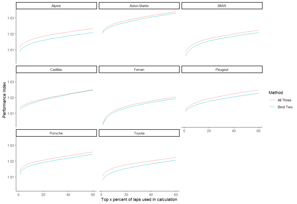
But possibly a more important question that “is it, in theory, a good idea?” is “does it do anything in practice?”. So let’s take a look. Specifics on how the process works aren’t, as far as I know, released. This is somewhat more important than it was, because there are a few different ways to think about the “two out of three” issue. The question arises because previously teams would have driven for roughly the same amount of time. However now teams that drop Qatar out have four hours less running than teams that don’t. (I’m using Qatar, Imola and Spa here – obviously ACO would have used Bahrain instead of Spa, which probably explains why Toyota got such a big nerf). So we need a method that’s agnostic to total running time. But we also need a method that cares about every lap. You can’t just compare the 60th percentile lap for every team (I really hope this isn’t what the ACO do) because that would give an advantage to teams whose better laps were faster. (Come to think of it, that would explain the failure to BoP Ferrari correctly). Let’s take a visual aid. Here’s the lap time for each manufacturer at Spa plotted against the lap percentile. (You can zoom in by using the scale at the bottom).
The goal should not be to make the laptimes on this graph when x = 60 be equal, but to have the area under the graph – the total race time to that point – be equal. But if we just used total race time we’d over-weight Qatar, so my plan is to use average (mean) lap time instead. Then to account for different circuit lengths, we’ll divide the average lap time by the fastest lap. This gives us a performance index for each track independent of both race length and track length. Then we combine those to see if it makes a difference if you take best two out of three or not.
Actually, because I’m apparently incapable of not making problems slightly harder for myself, I did the above for every “top x%” from 1 to 60.
Performance Indices
The answer is that yes, it does make a difference – provided you’re not Cadillac:
Obviously everyone is slightly closer to the fastest lap if you take their best races, but the amount varies. Cadillac’s performance hardly changes at all, while Alpine and Toyota have big gains. (If you’re curious, Alpine’s problem race is Qatar; Toyota’s is Spa. Well, kind of. Toyota were best at Imola, worse at Qatar, and about as much worse again at Spa).
Let’s zoom in on x = 60, since that’s what the ACO actually uses…
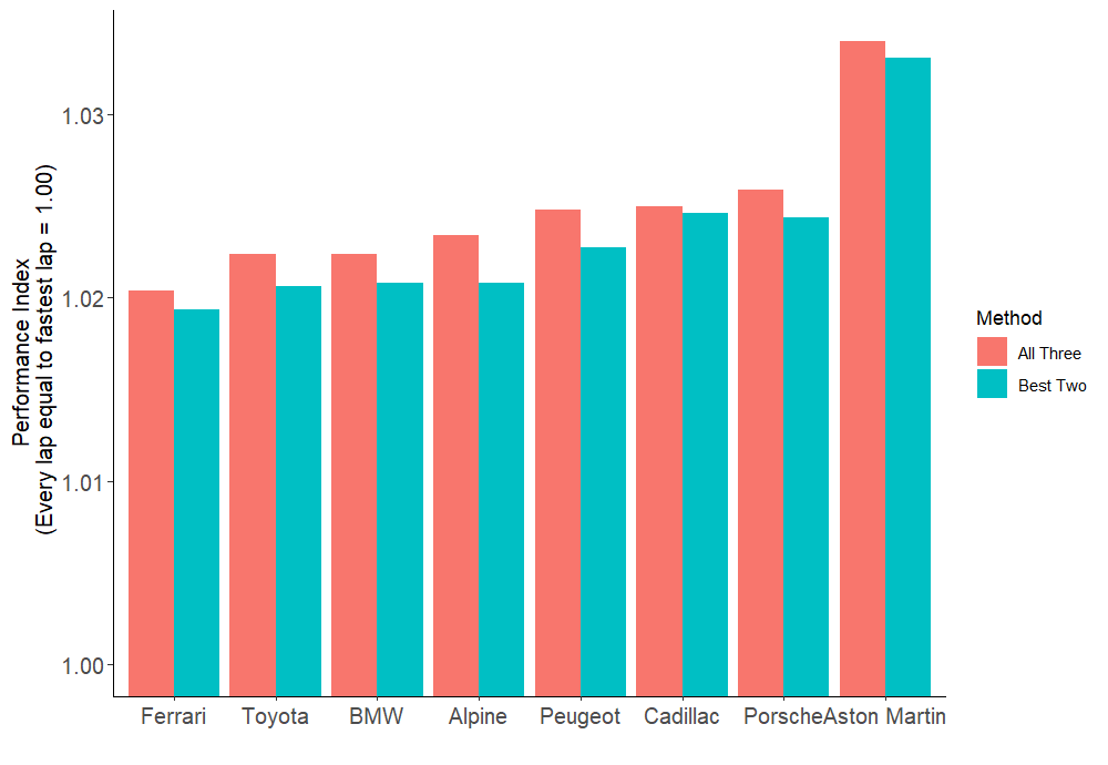
So here we can see that the difference between the “all three” and “best two” methods actually has a quite meaningful difference in the order the teams end up in.
Everyone (except Aston Martin) is closer together if we only take their best two races. This makes sense, of course – we’re basically picking the races when each team was closest to Ferrari. Behind Ferrari the pecking order on the old system was BMW, Toyota, Alpine; on the new one, it’s Toyota, Alpine, BMW.
Of course you want to be doing worse by this metric, so that the BoP moves towards you. So in practice the “best two” measure favours:
- Ferrari, because the others get closer to them using it
- Cadillac, because they don’t have a particularly bad race to drop (Qatar was a terrible race, but not by an “average pace” metric as it doesn’t know they spent half of it in the pits).
It disfavours:
- Alpine, whose weak Qatar performance no longer matters much
- To a lesser extent, Toyota and Peugeot, who mostly just have one good race but are now diluting it less.
Because I can’t let it drop
For funsies, what if we were still looking at the top 10%? It’s not like I have to do more work than changing a “6” to a “1” in my code to plot that graph after all.
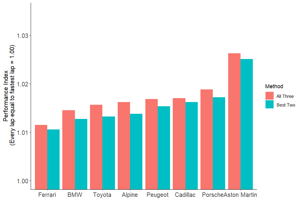
I’ve used the same axis as the previous graph, so you can see everyone’s much faster. Obviously. I mean, these are their best 10% of laps compared to their best 60% earlier. The order is almost the same, but Toyota drop behind BMW and it’s not even that close. Additionally, Porsche are now significantly further behind Cadillac than they were before.
Not coincidentally, Toyota and Porsche were a) last year’s WEC champions and b) the most, um, “vocal” critics of the BoP at Spa. (Teams aren’t allowed to talk about it, but both managed to make their opinions entirely clear). Using their significant experience of prototype racing, both teams designed cars that kept tyres in good shape and shouldn’t lose too much pace across a stint. Or in other words, whose 60% laps were closer to their 10% laps. This is no longer an advantage (it’s actually a subtle disadvantage, as it means you qualify worse), and they’re mad about it. I’m also mad about it, but not so much as I didn’t spend any money to design a car to the old rules.
The Next Race…
So to wrap this up, what should this mean for the BoP at Le Mans? Well, we don’t know. Le Mans uses a different calculation about which fewer details are known. Additionally, my approach here is a bit oversimplified. Because the BoP was different for all of these races, and really you should take this into account when making this comparison. That was way too much work for a blogpost, though.
But with that caveat, and if the ACO did use the same method at Le Mans, it should change like this:
- Peugeot: I’ve put them first because they’re the “reference” car; at minimum weight and maximum power. They stay put, everyone pivots around them.
- Ferrari, Toyota, BMW, Alpine: As they were all faster than Peugeot, they should lose performance. Ferrari the most, then pretty much identical amounts for the next three. Probably about two-thirds as much.
- Cadillac, Porsche: Slower than Peugeot by similar amounts, should probably gain about as much performance as Toyota, BMW and Alpine lose.
- Aston Martin: Bring ’em down to 1030 kg/ 520 kW, I say.

Leave a comment